
It is obvious that you need to work on your popups so that they are as effective as possible and above all to collect the email addresses of prospects on your website.
However, designing good enough popups can be a tricky step, since you have to think about what the popup will look like. perfectly matches its target audience to convert him and not annoy him.
So how to achieve this? Quite simply using a pretty design, but also a little psychology.
So what we are going to offer you in this article: these are 9 examples of effective popups that combine a beautiful design as well as triggers to encourage visitors to take action.
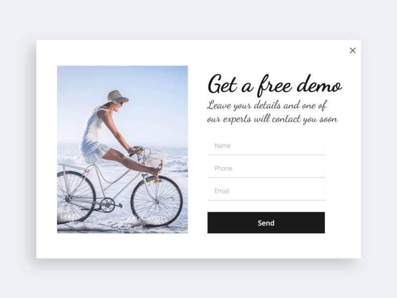
1. A popup targeted to a typical audience
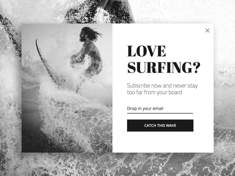
Generally speaking, popups that are targeted to a particular audience tend to get more conversion. Here, the pop-up window is aimed at surfing enthusiasts and the image used will have a strong resonance with this audience, and will also provide them with emotion.
You should know that images in popups tend to play a role important role to allow its conversion rate to increase. So including beautiful images is a great way to convert more easily.
This type of popup will perfectly match potential customers who are interested in the articles on the site or who show interest in making a purchase.
Furthermore, when you want to create this type of popup or other types of popup windows, it is imperative to use the right tools. For this, there are obviously several solutions on the market and one of them is Poosh.io.
Indeed, this tool is very simple to design pretty popups, notifications or other messages and also allows you to improve your conversion rate. This will automatically lead to an increase in sales and turnover.
2. Uniqueness in pop-up windows
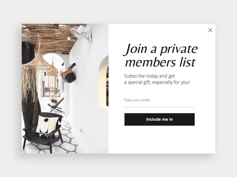
Being able to give a visitor the feeling of being privileged when they arrive on a website for the first time already makes a very good impression on them.
In the example above, an exclusive offer is offered to a prospect to arouse their curiosity and arouse their interest in giving their email address.
The principle is simple. By giving him the chance to join a private group in order to get a gift, it may be enticing enough for him to take action.
Furthermore, by using simple and clear language, it also allows them to understand that they need to take action.
3. A clear and short popup
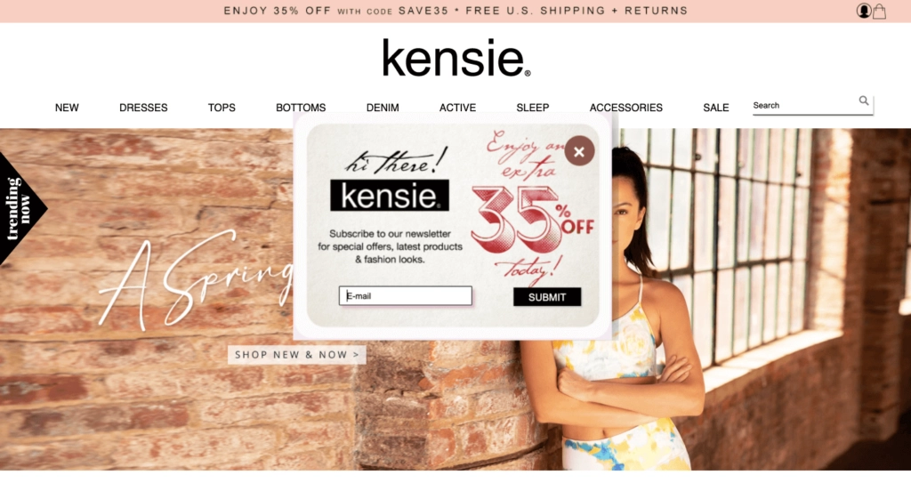
When an Internet user is browsing a website and a popup appears, it is not uncommon for them to close it immediately to continue browsing the page quietly.
Therefore, to ensure that you capture their attention, what it is interesting to do is to be very clear on the offer which we put in its popup window.
It would even be better to put a short message and highlight certain elements such as the percentage of the discount.
We will also avoid putting too many input fields to fill out. In the example above, only one field is enough to access the offer.
You should also keep in mind that prospects will not necessarily have the time to fill in information fields that are too long and they may be wary when asked for a lot of information.
So, by removing this type of obstacle, we optimize our chances of having more email addresses.
4. Retain visitors with exit-intent popups
Marketing experts say it: exit-intent popups have a high conversion rate. However, you need to include the right incentive to retain the visitor.
This kind of popup is usually ideal for people who have shown some interest in a website’s products, for example by spending some time browsing on it. If he was about to leave the page, it could mean that he still has some doubts about taking action by making a purchase.
Therefore, by offering them an interesting offer, this can change the situation and encourage them to leave their email address even if they do not make purchases right away.
In any case, by capturing their email, it will be easier for an e-retailer to get them to make a purchase later.
5. Offer expert advice with popups
In the event that a website offers products or services requiring expert advice, it may be interesting to display a popup to invite a visitor or customer to seek advice.
Generally, if there was any hesitation on his part to purchase any of the products on the site, it could erase your doubts and allow him to take action.
6. Discount popups for first purchases
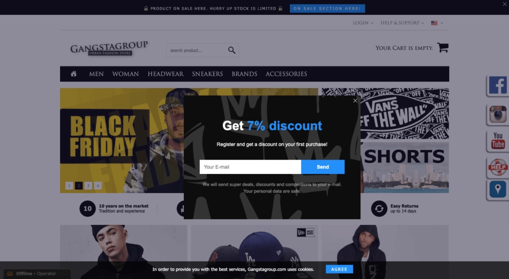
In this example, the e-retailer offers visitors a discount when they make a first purchase on the website. It’s a very simple popup that aims to obtain your email address in exchange for a promo code for a 7% reduction.
The popup that includes an offer and a call to action is very clear because it explains what the visitor will receive by registering and also provides an interesting proposition.
Knowing that people like to save money by receiving discounts, this kind of popup works rather good when you want to capture emails.
7. Invite users to join a workshop with popups
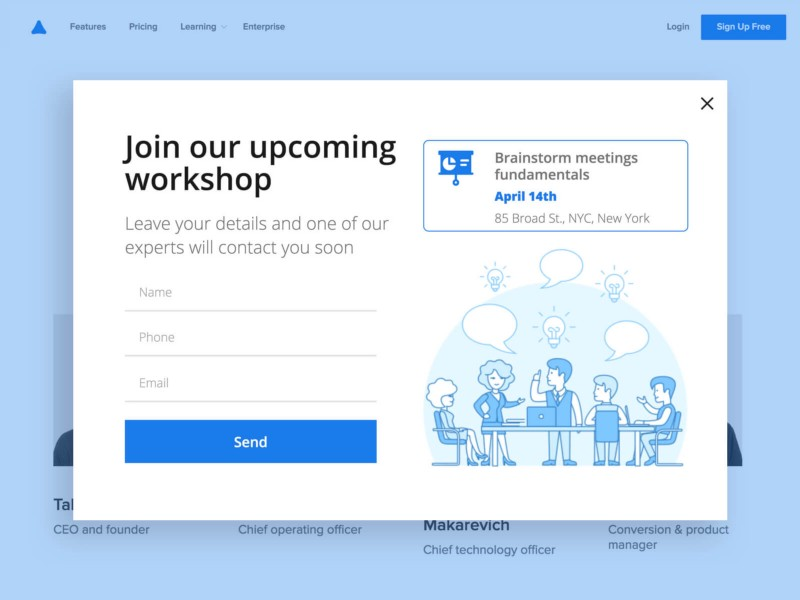
Normally, it is preferable to use popups that will subtly encourage a visitor or customer to take action. However, in some cases such as participating in online workshops, webinars or training courses that aim to sell something at the end, it is better to take a direct approach.
In this case, we will use clear and attractive messages. The goal is to interest them in registering for the free event without them necessarily suspecting what will be sold to them afterwards.
Once again, people like free things and if they have the impression that they will gain some knowledge from what is offered to them, this will tend to make them curious and trigger an action on their part.
8. Use different formats
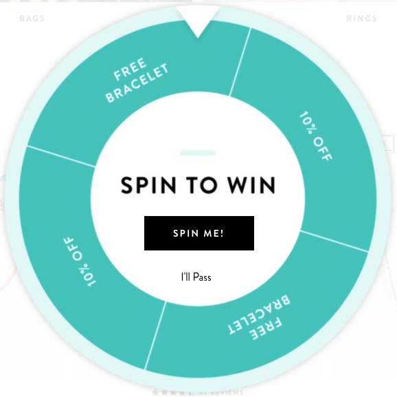
An interesting way to capture the attention of Internet users is to use popups with different formats.
For example, a wheel of fortune can be tempting enough to get a visitor to click and it’s a good way to ask for their email address afterwards.
9. Popups with a beautiful visual
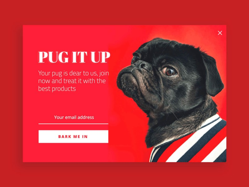
Finally, to continue with the visual side of popups, it is also possible to use very bright colors as long as it matches the site.
It’s a great way to capture the visitor’s attention. And even if in general, e-retailers prefer sober colors, certain flashy visuals when used well can also be very effective.
You will have understood, popups are available in all shapes and colors.
Knowing that these powerful tools are ultra effective for developing a mailing list and increasing its conversion rate, it goes without saying that you need to know how to use them well and adapt them to your website and target audience.