Are mobile pop-ups an essential marketing tool or a nuisance for your users? Poorly designed, they can frustrate your visitors and harm your SEO. However, when well optimized, they boost your conversions without compromising the user experience. Discover in this article the essential rules to get the most out of mobile pop-ups while satisfying your visitors.
1. Understanding the Challenges of Mobile Pop-ups
Mobile pop-ups are powerful tools for capturing visitors’ attention, but they can quickly become a hindrance to a smooth user experience. When misused, they disrupt navigation, increase bounce rates, and negatively impact brand perception.
User Frustrations
Mobile users, often seeking quick and intuitive navigation, do not tolerate intrusive interruptions well. Pop-ups that cover the entire screen or are difficult to close are the most problematic. For example, a user looking for specific information may quickly leave a site if a window blocks their access to the main content. A study by Nielsen Norman Group reveals that intrusive mobile interfaces reduce the likelihood of visitor retention by 40%.
The SEO Impact of Poorly Designed Pop-ups
Google introduced specific penalties for intrusive pop-ups in 2017 through its algorithm, thus affecting the ranking of sites on mobile. Known as the “interstitial penalty,” this criterion targets pop-ups that completely obscure content as soon as the user arrives or that are shown too frequently. As a result, poor use of pop-ups can not only irritate visitors but also reduce the visibility of the site in search results.
2. Essential Rules for Optimized Mobile Pop-ups
For mobile pop-ups to become effective tools for your conversions, they must be designed to respect the user experience while meeting marketing goals. Here are the fundamental rules for creating effective and non-intrusive pop-ups.
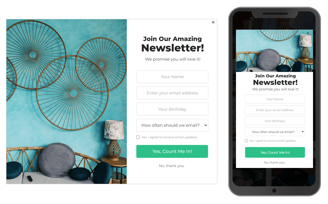
Favor Non-Intrusive Pop-ups
One of the keys to a successful pop-up lies in its timing and format. Pop-ups that appear immediately upon opening a page or that completely block content frustrate visitors. Prefer windows that appear after a reasonable delay (3 to 5 seconds) or that are triggered by specific behavior, such as exit intent. Additionally, opt for lightweight formats, such as banners at the bottom of the page or minimized pop-ups, which keep content visible.
Prioritize Easy Closure
A pop-up that cannot be easily closed annoys users. Ensure that the “Close” button is clearly visible and accessible, even on small screens. A good practice is to position this button in the upper right corner, with a size sufficient to be easily clicked, even on mobile. Allowing users to close the pop-up by swiping down or to the side also enhances the experience.
Customize Your Messages for Greater Relevance
A generic pop-up is unlikely to interest a visitor. Customize your offers based on user behavior. For example, if a visitor returns multiple times to a product page, suggest a specific discount for that item. Similarly, a message inviting users to subscribe to a newsletter should clearly state the benefits, such as exclusive content or promotions.
Test and Analyze Your Pop-ups
The effectiveness of a pop-up depends on its continuous optimization. Monitor indicators such as click-through rates, time spent on the page, and conversions generated. For instance, a pop-up displaying a promotional code may need to be adjusted to better meet visitor expectations if its click-through rate is low. Tools like Google Optimize or OptinMonster allow for A/B testing to identify the most effective variations.
3. Alternatives to Enhance User Experience
While mobile pop-ups can be optimized to minimize their negative impact, it is sometimes wise to explore alternatives to provide an even smoother user experience while achieving your conversion goals. Here are some effective options that respect visitors’ expectations while remaining performant.
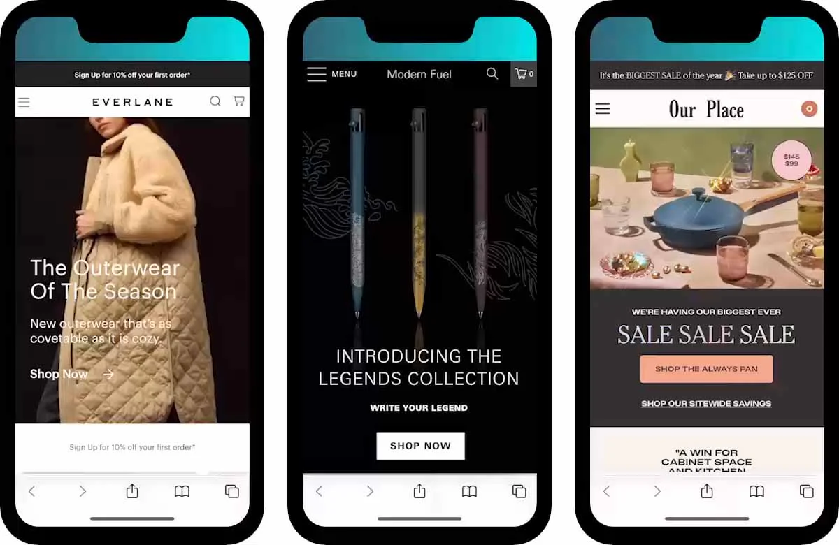
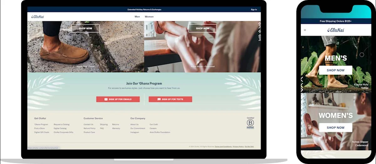
Integrate Discreet Calls to Action (CTAs)
CTAs embedded in your site content offer a subtle and non-intrusive approach. For instance, a button or a fixed banner at the bottom of the screen can invite visitors to subscribe to a newsletter or take advantage of an exclusive offer. These elements are visible without disrupting navigation, thus increasing the chances of conversion without frustration. A study by HubSpot indicates that integrated CTAs generate a click-through rate 47% higher than traditional pop-ups.
Utilize Push Notifications
Push notifications are a powerful alternative for engaging your visitors, even after they leave your site. These messages, sent directly to the phone or browser, can remind users of an ongoing promotion or re-engage a visitor who abandoned their cart. On average, push notifications display a click-through rate of 7%, well above the rates observed for traditional emails.
Respect User Expectations
Visitors appreciate being able to choose how to interact with your site. Offer clear options to customize their preferences, such as explicit requests for pop-up acceptance or the ability to disable them for a specified period. This ethical approach improves the perception of your brand while enhancing user satisfaction.
Optimizing your mobile pop-ups is crucial for capturing leads while respecting the user experience. With Poosh, the number one solution for notification pop-ups, you can transform your visitors into qualified leads through engaging and non-intrusive campaigns.