
Why do some pop-ups instantly capture attention and turn visitors into qualified leads, while others are ignored or even perceived as intrusive? When well-designed, these pop-ups are powerful conversion tools. However, their effectiveness depends on several factors: timing, design, message… and much more. In this case study, we will break down the good and bad practices to optimize your pop-ups and maximize your conversion rate. Ready to discover the secrets of the most effective pop-ups? Read on!
1. The key elements of a high-performing pop-up
Pop-ups are formidable tools for capturing visitors’ attention and converting them into leads. However, their effectiveness depends on several strategic factors. A poorly designed pop-up can harm the user experience and lead to a decrease in conversion rates. Conversely, a well-optimized pop-up can have a significant impact on your results.
1.1 Strategic timing
The moment a pop-up appears is crucial for its effectiveness. If displayed too early, it risks being perceived as intrusive. If too late, it may go unnoticed.
Best practices include:
✔️ Scroll-based pop-up: it appears after a visitor has scrolled a certain percentage of the page.
✔️ Exit intent pop-up: it displays when the user is about to leave the site.
✔️ Timed pop-up: it appears after a few seconds, allowing the visitor to absorb the content.
💡 Concrete example: An A/B test conducted by Sleeknote revealed that pop-ups triggered after 8 seconds generate 40% more conversions compared to those displayed immediately.
1.2 An engaging and non-intrusive design
An effective design captures attention without disrupting the user experience. An overly aggressive pop-up, with garish colors or intrusive animations, is likely to be immediately closed.
📌 Principles of good design:
✔️ Simplicity and readability: a clear message and appropriate typography.
✔️ Visual harmony: contrasted but pleasant colors.
✔️ Mobile adaptability: 60% of web traffic comes from mobile; a non-responsive pop-up greatly reduces conversions.
💡 Key takeaway: A well-thought-out design guides the user towards action without making them feel forced.
1.3 A clear and irresistible value proposition
The content of the pop-up must give the user a compelling reason to act immediately. A vague or generic value proposition will not encourage engagement.
📌 Key elements of a compelling message:
✔️ An attention-grabbing title: it should address a specific need. E.g.: “Get 15% off your first order!”
✔️ An optimized CTA: a visible and enticing button (“I want my offer”, rather than “Submit”)
✔️ A sense of urgency: phrases like “Limited offer” increase the conversion rate.
💡 Example: Poosh allows you to test different notification formats to identify the messages that convert best based on visitor behavior.
2. Case study: Comparison between an effective pop-up and an ineffective pop-up
Even if a pop-up is visually well-designed, it does not automatically guarantee a good conversion rate. Certain errors can render it ineffective, while other optimizations turn it into a real acquisition lever. Let’s compare an example of a pop-up that fails to convert with another that applies good practices.
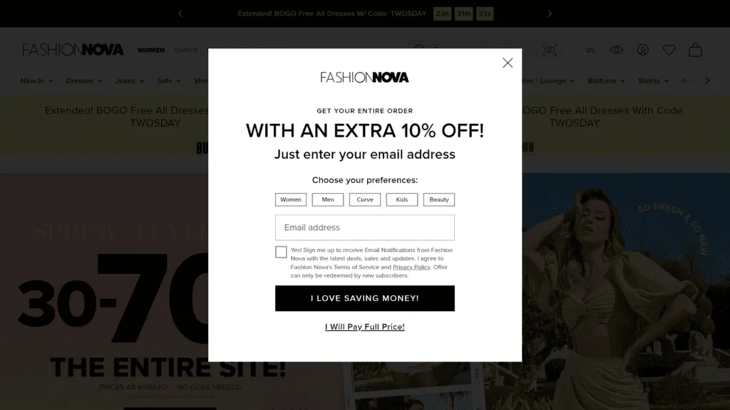
2.1 Ineffective pop-up: why does it fail?
A poorly optimized pop-up can harm the user experience and lead to a loss of traffic. Here are the most common mistakes:
🚫 Intrusive display: A pop-up that appears as soon as the page is opened, without giving the visitor time to explore the content, is often perceived as aggressive.
🚫 Absence of added value: A simple “Subscribe to our newsletter” provides no clear incentive.
🚫 Inappropriate design: An overloaded pop-up, with low contrast or a barely visible CTA, reduces interaction rates.
🚫 Poor targeting: Displaying a pop-up to a visitor who is already subscribed or who recently converted can be counterproductive.
💡 Concrete example: A study by HubSpot shows that non-segmented pop-ups can generate a bounce rate higher than 70%.
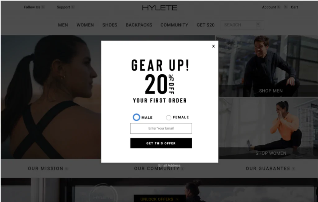
2.2 High-performing pop-up: best practices applied
An effective pop-up relies on a well-defined strategy and targeted optimizations:
✔️ Intelligent display: A pop-up triggered after 10 seconds or based on exit intent captures attention better.
✔️ Clear value proposition: An attractive offer (“Download our free guide”, “Get 20% off today”) drives engagement.
✔️ Clean and readable design: Well-thought-out contrast and a striking CTA increase the click rate.
✔️ Personalization: Tailoring the pop-up based on user behavior improves relevance and conversion.
💡 Example of optimization: Poosh allows for the display of pop-ups to be adapted based on visitor actions, ensuring a more targeted and effective approach.
A well-designed pop-up can transform a simple visitor into a qualified lead. By optimizing its timing, design, and message, you maximize your conversions. Test, adjust, and adopt best practices. Ready to boost your results? Try Poosh now!