Case study: How a simple exit pop-up increased conversions by 25%?
Did you know that a simple exit pop-up can turn a hesitant visitor into a loyal customer? Although often underestimated, these tools can have a remarkable impact on conversions when used strategically. In this case study, discover how an e-commerce site increased its conversions by 25% thanks to a well-designed exit pop-up. Ready to understand the keys to this success and apply these principles to boost your own results? Dive into this article and be inspired!
What is an exit pop-up?
An exit pop-up is a pop-up window that appears when the user is about to leave a webpage. Unlike traditional pop-ups, it is designed to capture attention at a specific moment, often just before the visitor exits the site. This tool relies on a trigger, such as the mouse movement toward the close bar or inactivity, to display an engaging message.

Definition and functionality
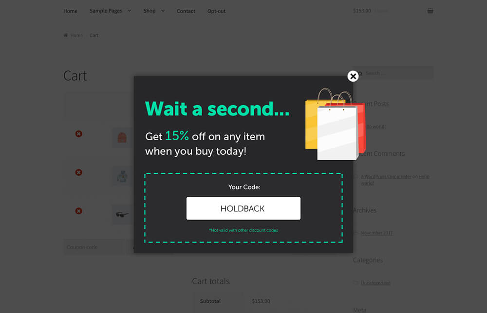
Exit pop-ups aim to retain visitors by presenting an attractive incentive. It could be a discount, an exclusive offer, or a request to subscribe to a newsletter. For example, an e-commerce site might display a message like: “Wait! Enjoy 15% off your first order by entering your email address now.” This type of approach helps turn a departure intention into a concrete action.
The benefits of exit pop-ups
The effectiveness of exit pop-ups lies in their ability to convert visitors who are about to leave. A study conducted by OptinMonster reveals that companies implementing exit pop-ups see an average increase of 10% to 25% in their conversions. In addition to boosting sales, these tools allow for the collection of valuable data, such as email addresses, or redirecting users to strategic pages.
When used correctly, exit pop-ups represent a powerful lever to reduce bounce rates and maximize the value of visits. Let’s now see how an e-commerce company transformed its performance with this strategic tool.
The case study: a winning strategy
The effectiveness of an exit pop-up can be measured through the example of an e-commerce site specializing in fitness products. Facing high traffic but a low conversion rate of 2.5%, the company was looking for a cost-effective solution to boost its sales without investing more in advertising.

Context and issue
With a wide range of products from gym equipment to dietary supplements, the site attracted a steady flow of visitors. However, a large portion of these visitors left the page without making a purchase, creating a concerning bounce rate. The main issue was therefore to retain these users at the crucial moment when they were considering leaving the site.
Implementing the exit pop-up
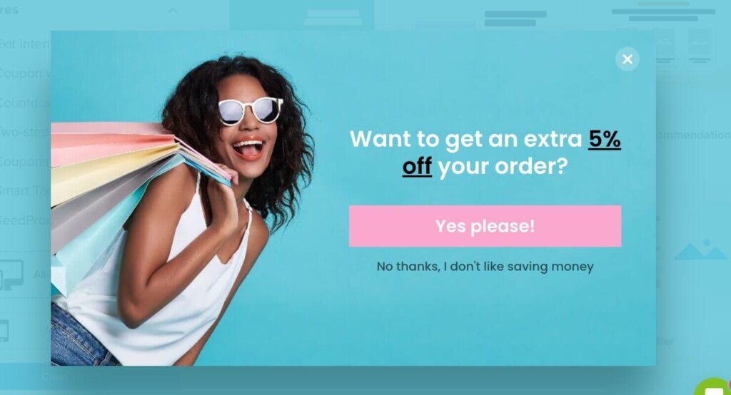
The adopted solution was a simple yet impactful exit pop-up. When a user attempted to leave the page, a 15% discount offer on his first order would appear alongside a field to enter an email address. The design of the pop-up was minimalist: an appealing image, a direct message (“Stay and save 15%”), and a clear call to action. The pop-up trigger was programmed to target only visitors who had spent at least 30 seconds on the site, thus increasing the chances of conversion.
Measured results
After implementing this strategy, the results were immediate:
- The conversion rate soared from 2.5% to 3.1%, representing a 25% increase.
- The number of collected email addresses increased by 40%, providing a new base for targeted marketing campaigns.
- The bounce rate significantly decreased, enhancing visitor retention.
This study demonstrates that a well-designed exit pop-up can transform a point of exit into a conversion opportunity.
The keys to a successful exit pop-up
For an exit pop-up to reach its full potential, it must be designed and implemented carefully. Here are the key elements that ensure its effectiveness, based on real examples and best practices.

Relevant and targeted content
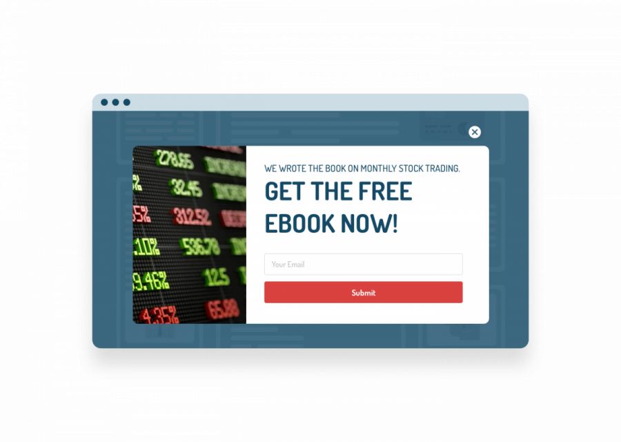
An exit pop-up must offer a proposition that instantly captures the visitor’s attention. This could be a discount, exclusive content (e-book, guide), or a time-limited offer. For example, an online beauty product store saw a 20% increase in its conversions by offering a free sample for any purchase over a certain amount. The message should be clear, personalized, and tailored to user behavior, such as a discount for visitors who viewed multiple products but had not yet added an item to the cart.
Optimized design
The appearance of the pop-up plays a crucial role. A simple, clean, visually appealing design helps maintain attention without distraction. Ensure that the call to action (CTA) is prominently visible and explicit, such as “Claim your discount now.” Contrasting colors, readable fonts, and a clear visual hierarchy also enhance the pop-up’s performance.
Continuous testing and analysis
No strategy is perfect from the start: A/B testing is essential to optimize your exit pop-up. Test different messages, visuals, and timings to identify what works best. For example, a SaaS company observed a 15% increase in click-through rates by replacing “Try for free” with “Start your free trial now.” Regularly analyzing performance allows for strategy adjustments and maximizes results.
How to apply this strategy to your site?
Implementing an exit pop-up on your site doesn’t require advanced technical skills, but a thoughtful and strategic approach is essential to ensure optimal results. Here are the key steps for effectively integrating this solution.

Tools and platforms to use
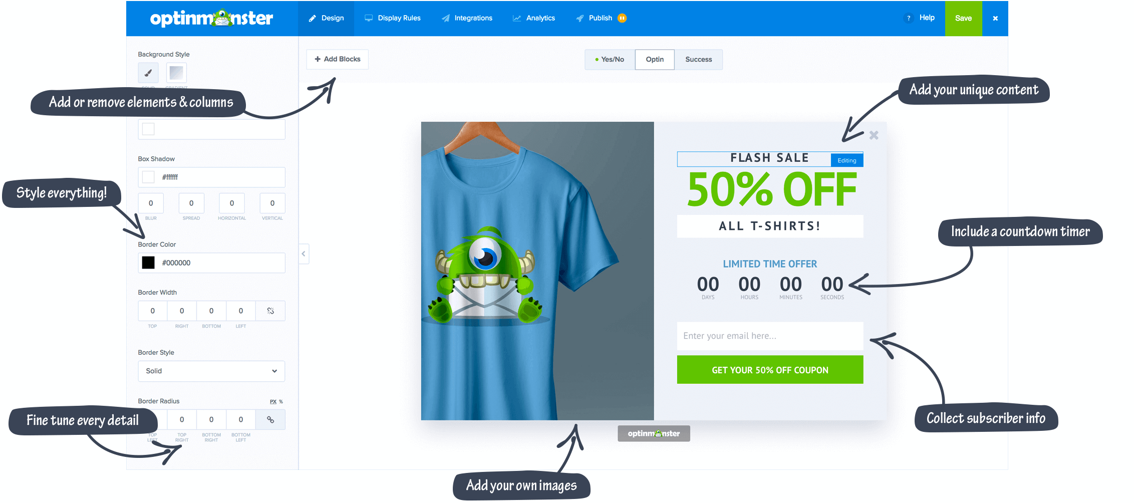
Dedicated tools, such as OptinMonster, Sumo, or Hello Bar, simplify the creation and integration of exit pop-ups. These platforms offer customizable templates, advanced targeting options, and performance analytics. They easily integrate with systems like WordPress, Shopify, or WooCommerce, making this strategy accessible even for small businesses. For instance, OptinMonster allows configuring triggers based on user behavior, such as mouse movement or time spent on a page.
Practical tips for successful implementation
- Analyze your traffic : Identify strategic pages where visitors most often leave, such as the checkout page or product sheets.
- Test on a key page : Start with a test on a single page to assess the impact. For example, a fashion site could target visitors abandoning their shopping carts with a limited-time offer.
- Customize the message : Tailor the content of your pop-up to the audience. A message like “Leaving? Enjoy 10% off your first order” is more engaging than a generic message.
- Monitor performance : Use the analytical reports from the tools to track click-through and conversion rates, adjusting your strategy accordingly.
A well-designed exit pop-up can transform your conversions. With Poosh, the number 1 solution for capturing leads, you have the necessary tools to engage your visitors and boost your results. Test this strategy today to maximize the impact of your site.