
Have you ever thought about the impact of your exit pop-ups on your conversion rate? These small windows that appear when your visitors are about to leave your site can be powerful tools for collecting emails, but only if used correctly. Too often, simple but crucial mistakes undermine their effectiveness. In this article, we will explore the 5 most common mistakes to avoid in order to maximize your chances of success. Ready to improve your email collection strategies? Read on to discover everything.
1. Not targeting the right visitors

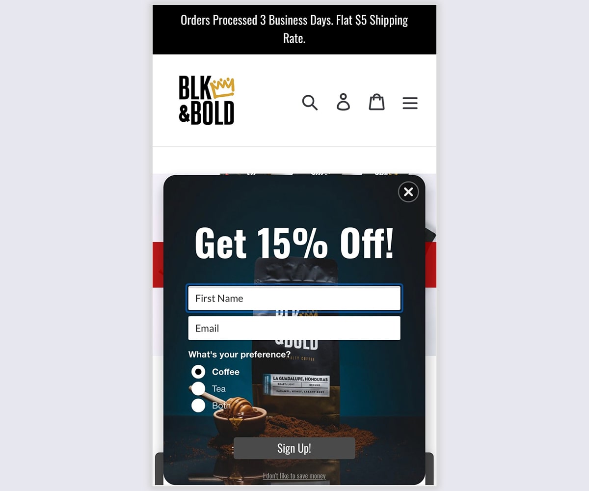
One of the major mistakes with exit pop-ups is not targeting the right visitors. Indeed, displaying the same message to all users, without distinction, can significantly reduce the effectiveness of your strategy. It is crucial to segment your audience based on criteria such as browsing behavior, purchase history, or traffic source. For example, a visitor coming from an advertising campaign might receive a different offer than one intended for a regular subscriber. According to a HubSpot study, targeted pop-ups can improve conversions by 42%. Use analytics tools to understand your visitors and personalize your pop-ups accordingly.
2. Offering an unappealing deal
Offering an unappealing deal is a common mistake that can drive your visitors away. A pop-up that does not provide clear added value is likely to be ignored. The offer must be perceived as interesting enough to encourage the user to leave their email address. For instance, simply saying “Subscribe to our newsletter” is rarely sufficient. Opt for more enticing incentives like a discount code, exclusive access to premium content, or a relevant free ebook. According to OptinMonster, personalized offers increase conversions by 11%.
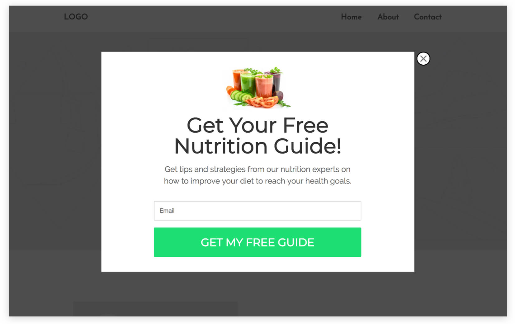
3. Neglecting the design of the exit pop-up

The visual design of an exit pop-up plays a crucial role in its effectiveness. A confusing or unattractive design can distract or deter the user. It is essential to create a pop-up that is both clear and aesthetically pleasing. Use contrasting colors to draw attention without overwhelming the screen, and limit the text to the essentials to avoid overwhelming the visitor. For example, a 20% discount offer should be highlighted with a readable font and a clearly visible call-to-action button. According to a Sumo study, an optimized design can increase conversions by up to 10%. The content should be concise, with a compelling message and a direct call to action.
4. Using inappropriate timing

Timing is a key element for the success of your exit pop-ups. Displaying a pop-up too early or too late can reduce its impact. A pop-up that appears immediately after the user arrives on the site is likely to be perceived as intrusive, while a pop-up shown too late could miss its target. Experts suggest that the optimal moment to trigger an exit pop-up is when the user shows signs of intent to leave, such as moving the mouse toward the close button. A study by ConversionXL reveals that pop-ups displayed at the right time can increase conversions by 9%.
5. Ignoring mobile optimization
With the constant increase in mobile traffic, ignoring the optimization of your exit pop-ups for mobile devices is a critical mistake. A non-optimized pop-up can become difficult to close or unreadable on a small screen, which irritates the user and pushes them to leave your site without signing up. To avoid this, your pop-ups must be responsive, meaning they need to adapt perfectly to all screen sizes. A Google study shows that 53% of users leave a site if it takes too long to load or if the user experience is poor.
By avoiding these common mistakes, your exit pop-ups can become powerful conversion tools. To maximize your results, consider using Poosh, the number one notification pop-up solution designed to effectively capture leads and enhance user engagement.