10 common mistakes to avoid with pop-ups on your niche site
Are pop-ups an effective tool or a source of frustration for your visitors? When used correctly, these windows can become a powerful lever to capture leads and increase your conversions. However, if poorly designed or poorly timed, they risk harming the user experience and tarnishing your brand image. What are the most common mistakes to avoid? In this article, discover how to optimize your pop-ups so that they become an indispensable asset on your niche site. Follow our tips and turn your visitors into customers today!
I. Content-related pop-up mistakes
The content of a pop-up plays a crucial role in its effectiveness. An offer or message that is poorly targeted can easily be ignored or even annoy your visitors. Here are common mistakes to avoid to maximize the impact of your pop-ups.

A. Not offering a relevant offer
One of the most frequent mistakes is presenting an offer that does not meet the expectations of your audience. For example, a visitor looking for technical advice will be little interested in a discount on an unrelated product. A HubSpot study reveals that 61% of users are more likely to interact with a pop-up if it is directly relevant to their needs. Make sure to tailor your proposals: for a niche travel site, an offer like “Receive our free guide to must-visit destinations” will be more engaging than a simple generic discount.
B. Lacking clarity in the message
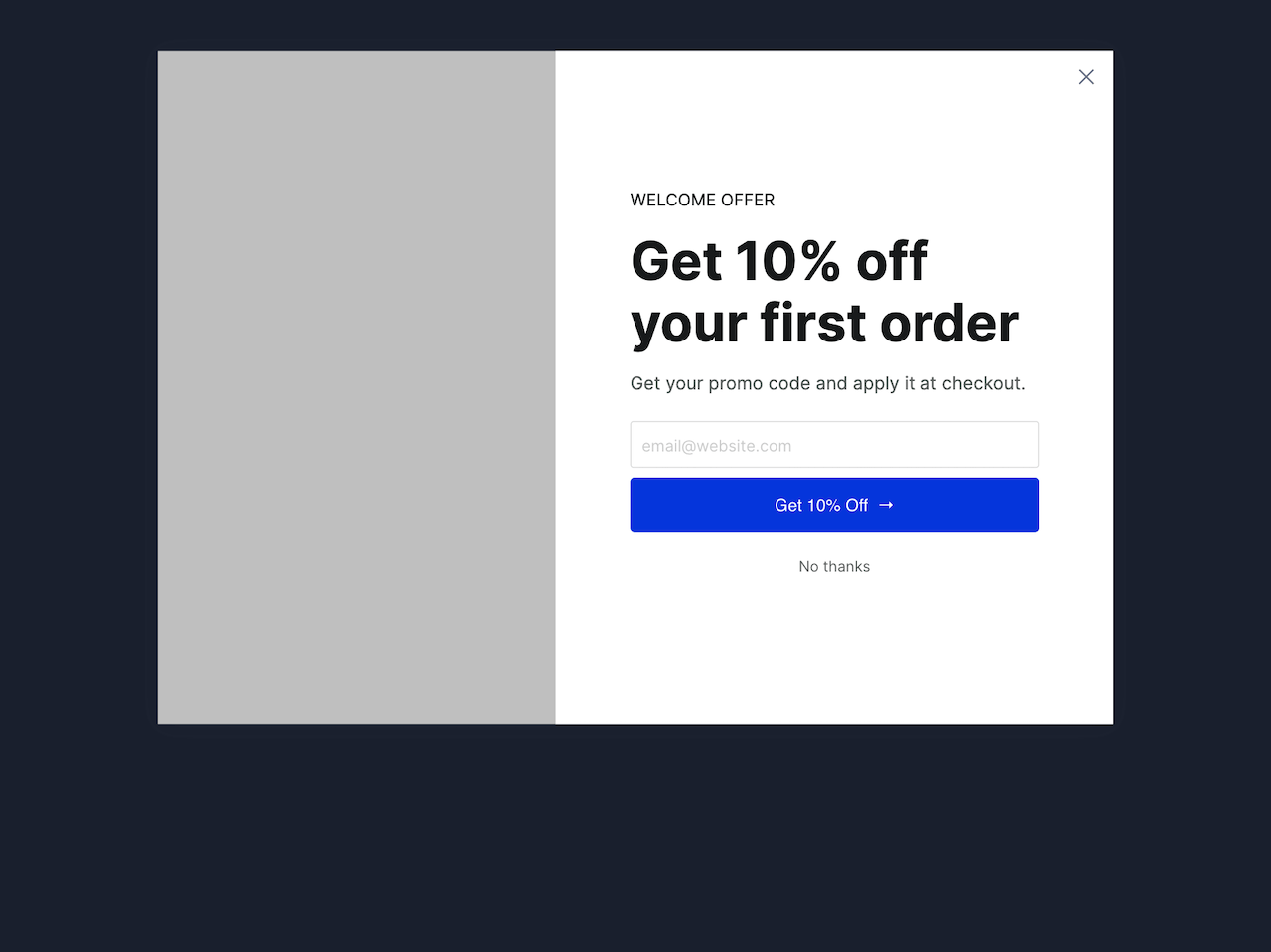
A confusing or overly long message can discourage your visitors before they even read the entire pop-up. Opt for short and impactful formulations, such as: “Enjoy 15% off today!”. By highlighting the benefits directly, you capture attention and encourage action.
C. Ignoring calls to action (CTAs)
A pop-up without a clear call to action is a missed opportunity. CTAs should be visible and enticing. For example, replace a generic button “Click here” with “I want my discount”. This personalization makes the message more engaging and increases the click-through rate.
II. Timing and frequency mistakes
The timing and frequency of your pop-ups are crucial elements for providing an optimal user experience. If mismanaged, they can quickly frustrate your visitors and reduce your chances of conversion. Here are common mistakes and solutions to avoid them.

A. Displaying pop-ups too early
A pop-up that appears as soon as a visitor arrives on your site can seem aggressive. Users often haven’t had time to browse the content or understand the value of your offer. According to a Sumo study, pop-ups that appear after 8 to 12 seconds are 50% more effective than those that show up immediately. Schedule your pop-ups to trigger after a meaningful interaction, such as scrolling a certain percentage of the page or a prolonged visit.
B. Overloading visitors with repetitive pop-ups
Displaying multiple pop-ups at close intervals or repeating the same offers can quickly annoy your visitors. This practice harms the user experience and can lead to high bounce rates. To avoid this, limit the display of pop-ups to once or twice per session and ensure they do not repeat after an interaction or refusal.
III. Technical and design mistakes
An effective pop-up relies as much on its content as on its design and technical functionality. Errors in these areas can not only harm the user experience but also impact the overall performance of your site.

A. Neglecting the design of pop-ups
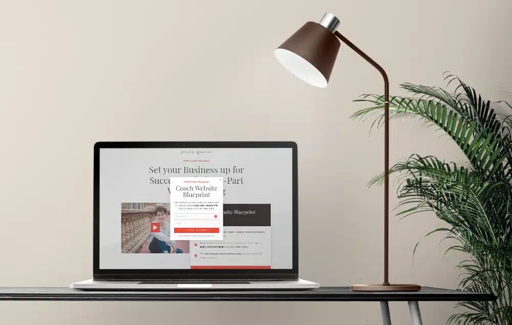
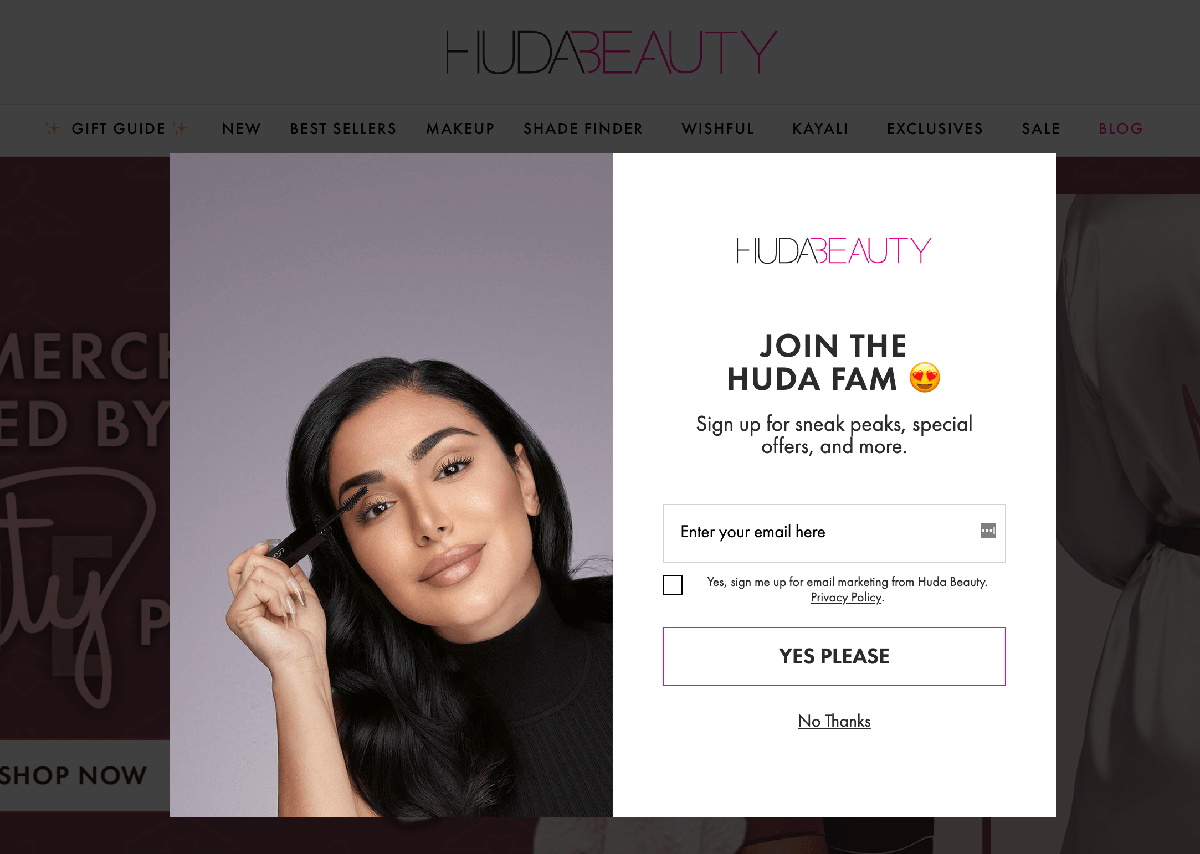
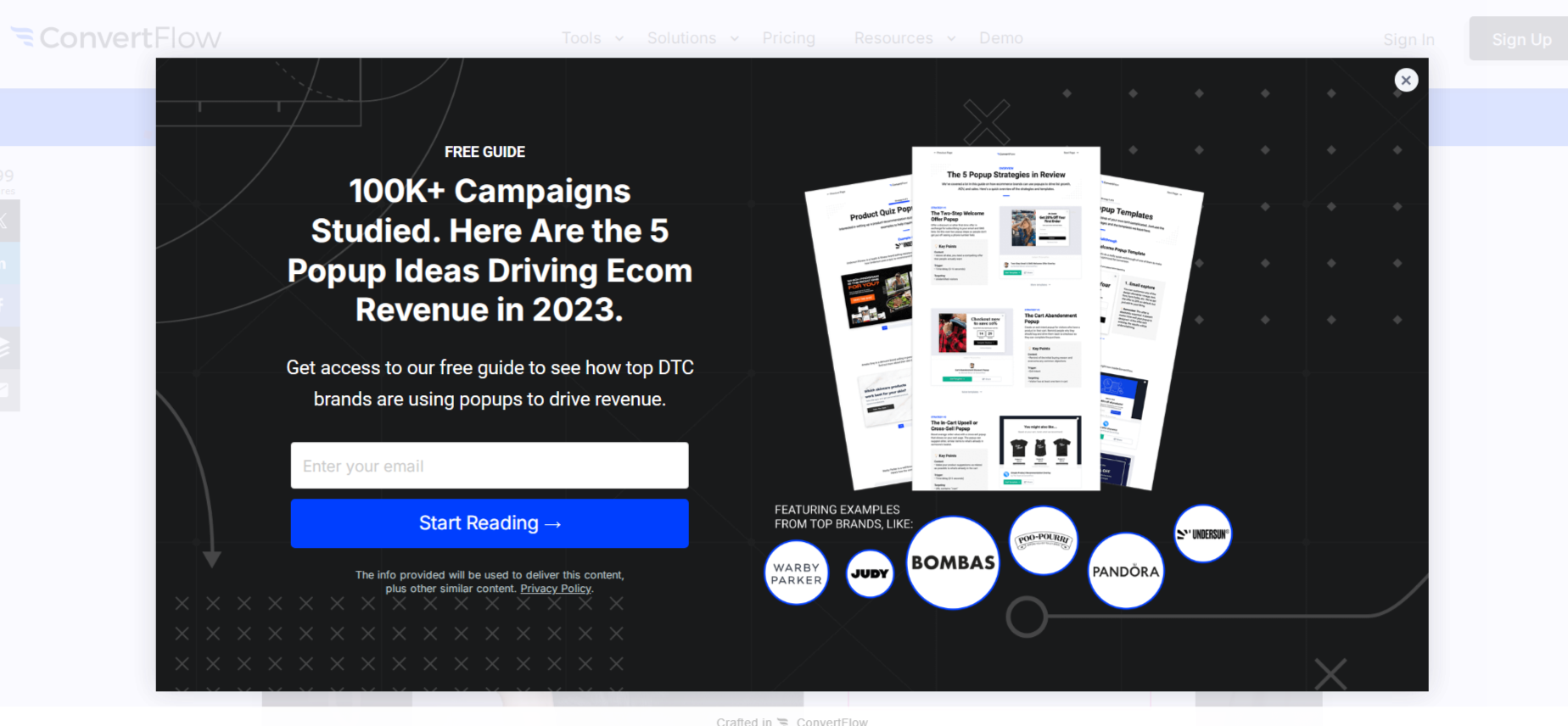
A poorly crafted or inconsistent design can give an impression of unprofessionalism. For example, illegible fonts, aggressive colors, or an overloaded visual layout can distract users’ attention. In contrast, a cleanly designed pop-up, aligned with your site’s visual identity, inspires confidence. Use contrasting colors to highlight key elements, such as calls to action, while ensuring graphical harmony is respected.
B. Not optimizing pop-ups for mobile
With over 50% of web traffic coming from mobile devices, a non-responsive pop-up can frustrate a large portion of your visitors. A common example: a pop-up whose close button is inaccessible on mobile, forcing the user to leave the page. Ensure that your pop-ups adapt to all screens, with an appropriate size and easily clickable buttons. Google also recommends limiting intrusive pop-ups on mobile to avoid search penalties.
C. Difficulty closing pop-ups
A pop-up that is difficult to close is one of the main irritants for visitors. If the close button is poorly visible or awkwardly positioned, it can lead to immediate frustration and increase the bounce rate. To avoid this issue, place the close button in an intuitive location, such as the upper right corner, and make it clearly visible with an obvious icon (for example, a cross).
IV. Analysis and optimization mistakes
A well-designed pop-up does not guarantee success if it is not continuously monitored and optimized. Ignoring performance or neglecting testing hinders the identification of areas for improvement. Here are common mistakes and how to avoid them.

A. Not tracking the performance of pop-ups
Many sites implement pop-ups without measuring their effectiveness. Yet, analyzing performance is essential to maximize conversions. Monitor key indicators such as:
- Display rate: How many visitors actually see the pop-up?
- Click-through rate (CTR): What percentage of users interact with the pop-up?
- Conversion rate: How many clicks translate into actions (sign-ups, purchases, etc.)?
Tools like Google Analytics or dedicated solutions like OptinMonster allow you to track these metrics. For example, if a pop-up has a low CTR but a high display rate, this may indicate that the message or offer needs to be adjusted.
B. Not testing different variants
The absence of A/B testing limits your opportunities for improvement. Testing different variants of your pop-ups is essential to determine what works best for your audience. Try modifying:
- The text: A formal tone (“Download our free guide”) versus an engaging tone (“Get your free guide now!”).
- The design: Colors, images, or layouts.
- The offer: Comparing an immediate discount with a free trial, for example.
An A/B testing campaign conducted by an e-commerce brand revealed that adding a countdown (“Offer valid for 24 hours”) increased conversions by 25%. These adjustments, based on concrete data, can transform your pop-ups into effective tools.
Optimizing your pop-ups, by avoiding common mistakes related to content, timing, design, and analysis, can turn your efforts into a real conversion lever. With an intuitive solution like Poosh, you can design, test, and adjust your pop-ups effectively while providing an optimal user experience.